Common Ground in Oslo

Connected city

Reinvent Paris

seesawing on the border wall

Fashion campus

World-class library

interactive landscapes

my favourite tree

the light of Gamberaia
connected city
Villa Gamberaia
Common ground
Common Ground is the intriguing title of the World Conference 2019 of the International Federation of Landscape Architects (IFLA). Those attending the opening ceremony in Oslo's Congress Hall heard beautiful music and words of optimism. We share our ideals of life, love and justice. And we share our landscape, our world. Sustainability and climate change are issues of course, as is democracy. All the landscape architects who had gathered in this beautiful green European capital seem determined to make the world a better place. This is not a sceptical comment – it was truly as though the horn playing the inspiring and honest overture to the conference blew away all thoughts of cynicism.
Common grounds are diverse, and their diversity is reflected in this e-zine. We offer some special examples, in the realm of public space: an
amazing paved area in the windy harbour of Amsterdam, an intimate space under a carob tree in Latin America, a play of shadow and light in the Villa Gamberaia in Italy. And we present the
masterplan for the most sustainable urban extension yet - in Hamburg.
This e-zine is the second of five annual numbers, published in combination with the paper edition of 'scape. The latest issue, #16, has arrived hot off the press – bursting with dossiers,
reviews, portraits and essays – just in time for IFLA Oslo.
We invite you to subscribe and join our common ground!
Harry Harsema
A fashion campus in the Houthavens
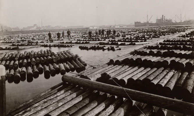
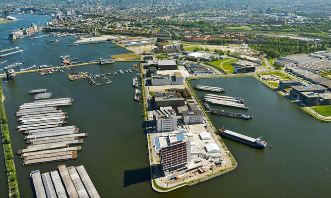
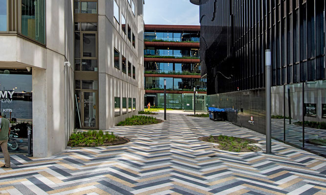
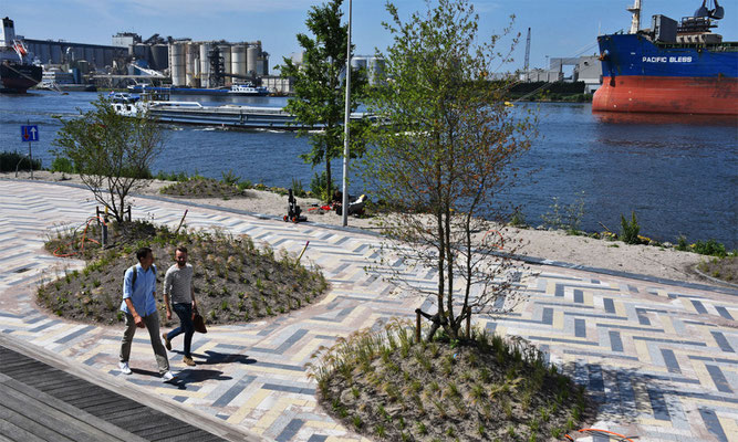
On the western side of Amsterdam's harbour you will find the Houthavens, where ships unloaded their cargo of logs in times gone by, and where now an interesting new district is emerging. The Danzigerkade quayside has become one of the new promenades with business developments. Many fashion and creative industries – including Tommy Hilfiger and Calvin Klein – can be found here, as well as hotels and restaurants which attract local residents.
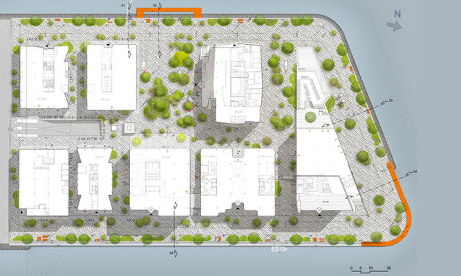
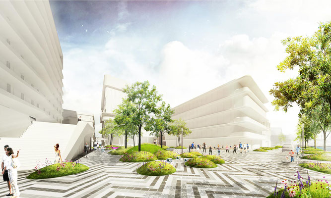
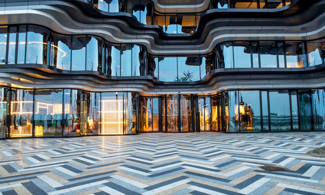
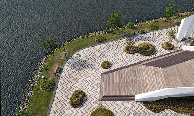
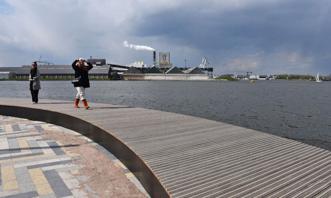
In their design for the public space, Buro Sant en Co referenced the history of the area, but they also sought a link to its current uses. The result is a daring design of pronounced contrasts. The striking paving – by Metten Stein+Design – runs right up to the facades of the buildings, laid in a herringbone design echoing a wooden floor. The pattern is not only a reference to the logs that used to be unloaded here, but also to the newly arrived fashion industry, echoing the woven herringbone designs in fabrics.
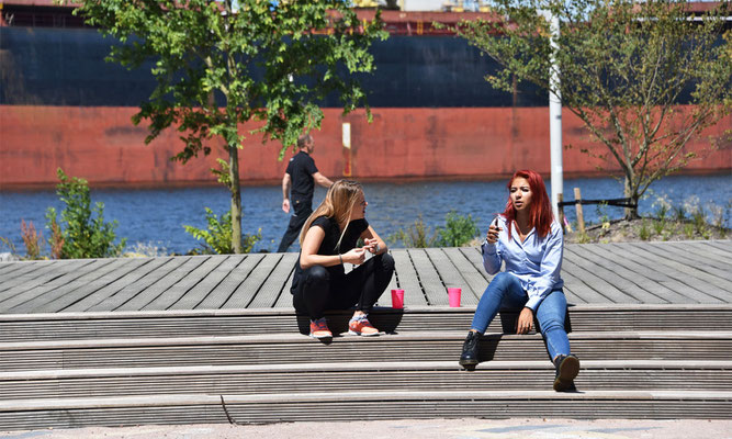
Greenery can be found in the form of organic, splat-shaped beds scattered over the quayside. A mixture of various trees and soft grasses accentuates the contrast with the stony environment. Because of the underground car park beneath, raised beds are needed for the roots. Rainwater is absorbed into their foundations and evaporates on hot days, cooling down the area. The large boardwalk is an inviting place to sit, watch, muse, show fashion and take photographs.
Project Public space
Location Amsterdam
Designer Buro Sant en Co
In collaboration with SmitsRinsma
Main Paving Supplier Metten Stein+Design
Commissioned by Heren2
Area 20,000 m2
Design 2017
Implementation 2018–2019
Budget €4 million

Greetings from Florence
All built environments and landscapes are bathed in light. As such, it goes without saying that light is a mighty and given component in their
designs. The first spatial designers understood this logic. In their worship of sun gods, and later of the God who created light on the first day (and sun on the fourth), they eagerly made use of
daylight to strengthen their spatial creations, and thus also fulfil the divine component.
Gardens whose designs were based on the classical components, such as daylight, have often become known as 'timeless'. One of these is the Villa Gamberaia (Settignano, Italy) whose typical 17th
century garden design is still there today. The entire effectiveness of this garden is underpinned by light. It darkens the dark colours and backlights the cypress trees, accentuating their shape
and enabling us to experience their bizarreness. It regulates our comfort, emotions and space-time orientation, making the garden into its own clock and guide, and the conduit for our experience.
Light is behind the overall functioning of the garden too: take the positioning of the lemon garden on the highest terrace to maximise the amount of sunlight to ensure a good harvest.
A walk through these gardens is like travelling through a series of individual spaces that perform a harmonious drama of darkness and light. From densely shaded tree canopied spaces and grottos,
to spaces between spaces, to the light-filled spaces where the grass colours poisonous green and the water sparkles fiercely. Nestle in the coolness of shadows, then step into the light for the
bright views over sunlit Florence and the Arcadian landscape: this is the show that defines the 'Gamberaian landscape'.
Ancient logics are so obvious that they are often forgotten out of habituation, then re-discovered because something didn’t make sense. So, no matter how lost a logic has become, we need not
worry about losing something that is immortal. Daylight in design remains one of the eternal ‘givens’ of timeless design.
Saluti from the editor in Florence
moving pictures
Reinvent Paris
New site at the Boulevard Périphérique
Metropolitan areas the world over are searching for ways to bring back nature to the city. In 2014 the city of Paris launched a call for innovative projects at 23 sites linked to the Boulevard Périphérique. 'People need nature in order to breathe,' were the mayor's words at the start
reinventer.paris.
One of the winning projects, a proposal for the site Ternes-Villiers, was designed by
the Danish firm SLA, together with French firms Jacques Ferrier Architects and
Chartier Dalix. ‘You can smell the pollution there. Only once I had stood at this location did I understand what the competition was
about,’ said Rasmus Astrup of SLA. Their design consists of two buildings, one with offices, one with apartments and
in between a garden. The buildings are covered with plants on all facades and there is a tea plantation on the rooftop. The entire construction spans the Boulevard Périphérique creating a
large amount of beautiful new greenspace with clean air and reduced noise.
Unity of play
Seesawing on the border wall
It was a worldwide hit on social media – people seesawing at the controversial border wall between the United States and Mexico. Architect and artist Ronald Rael placed three fluorescent pink seesaws so
that family members – especially children – who are separated from each other by the wall are still able to play together. The installation was dramatically portrayed in drone footage, as
only from the air is it possible to see how children at play connect two worlds. 'There are not two sides defined by a wall,' says Rael. 'This is one landscape, divided.'
LocHal Library
A world-class library for Tilburg
For a period of almost thirty years the name Tilburg (the Netherlands' sixth city) was associated with empty buildings, poverty and unemployment. Today the city is vibrant and full of
surprises. New buildings stand proudly and the textile factories that closed in the mid 1980s have been put to exciting new uses. The area immediately behind Tilburg's railway station,
previously an uninviting strip that barred the way between the city centre and the districts to the north, has also been completely overhauled.
The imposing 'LocHal' where locomotives were repaired is now a public library. The design is the result of a joint effort between Mecanoo
Architects, CIVIC Architects, Braaksma & Roos Architects Office,
Inside Outside landscape architects and interior designers, and Tilburg's
TextielMuseum. The latter's input is visible in the enormous curtains which can be used to divide the large hall into smaller spaces.
Mecanoo Architects made a film that takes you on a tour through the new library.
PRESENCE
Interactive landscapes by Daan Roosegaarde
Dutch artist Daan Roosegaarde is well known for his interactive, sculptural interventions. His office, Studio Roosegaarde,
recently designed the spectacular 'Gates of Light' in which the series of locks in the Dutch Afsluitdijk are
illuminated. The project won one of the International Architecture Awards 2019 for its 'poetic excellence’.
'Presence' is an imposing indoor phosphorescent landscape currently on show in the Groninger Museum in the Netherlands. It is
Roosegaarde's first solo artwork and is a reflection of his ponderings on the influence of human beings on the landscape and the power of technology. 'If we don't invest in new ideas we will
simply drown,' said Roosegaarde when interviewed about his exhibit. He quotes Marshall McLuhan: 'There are no passengers on spaceship earth. We are all crew.' The exhibition provides no
answers but is intended to trigger the imagination and curiosity of those who experience the installation. Roosegaarde's exhibit is on show until 12 January 2020.
– ADVERTORIAL –
A touch of class on the Danzigerkade
The striking paving on the Danzigerkade in the Amsterdam Houthavens was supplied by Metten Stein+Design. The classic herringbone pattern used in English parquet floors references
the past as well as the fashion industry now located there. The contrasts in colour and were created by combining polished Samtiert® and fine washed stone surfaces. The colour
effect is optimised by targeted use of Metten’s CleanTop® Technology. The upbeat paving enhances the feel of this popular quayside area.
www.metten.com


Favourite tree of ...
Martin Knuijt
In many places we have lost our connection with nature and even with how food is produced. We need a new relationship between citizens and green space: if it is hard, make it soft. If
it is soft, make it green. Or do both steps in one. Trees make a powerful contribution to meeting places in the public realm, and they help to make pedestrian routes more comfortable.
Take the typical squares in the towns and cities of Latin America, they all contain trees. I love the image of the man in the long poncho, resting under the majestic Algarrobo tree in an Andean village, while just a few metres away there's a party going on
under the shade of the trees. The old mother tree oozes power, an example of how trees create atmosphere in a public space. If we can change public spaces so that they enhance social,
economic and cultural well-being, our cityscapes will change for the better. Green cityscapes will provide pleasant and safe places, becoming the backdrop to a city that provides
space for all, including our children. And if they feel at home, cities will be the decor for a bright future.
Martin Knuijt is a landscape architect and founder of OKRA Landscape Architects
Hamburg's new neighbourhood

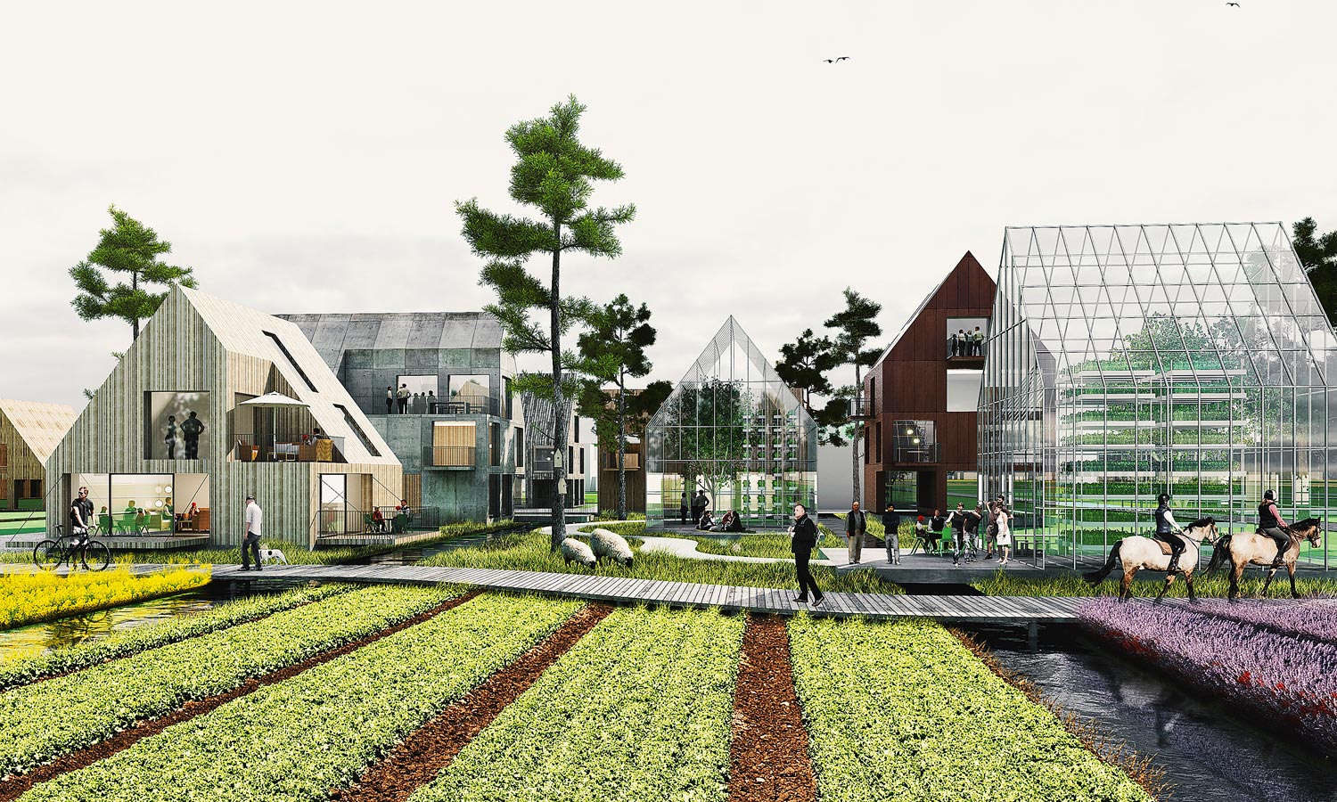
Oberbillwerder, Connected City
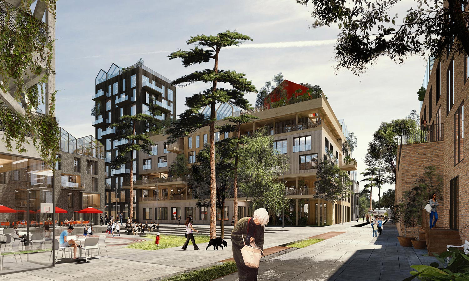
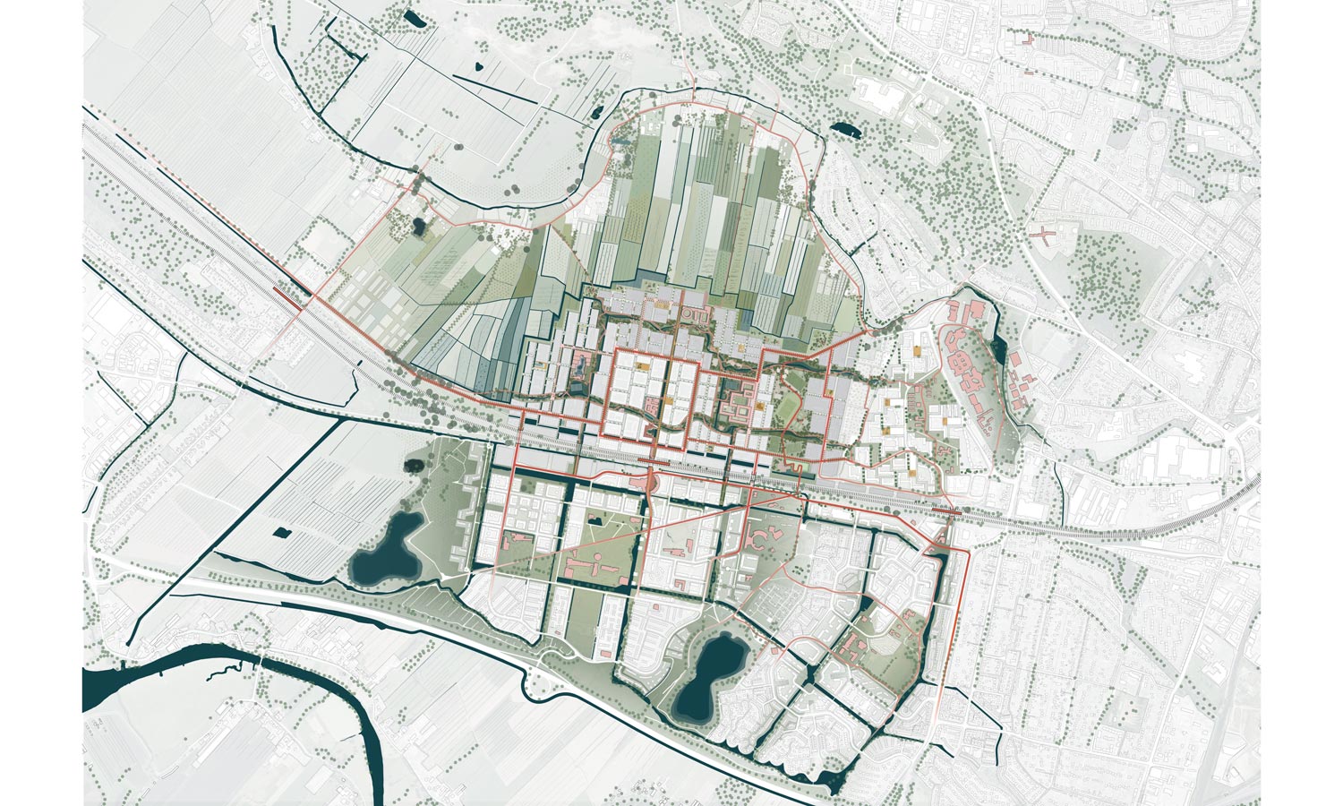
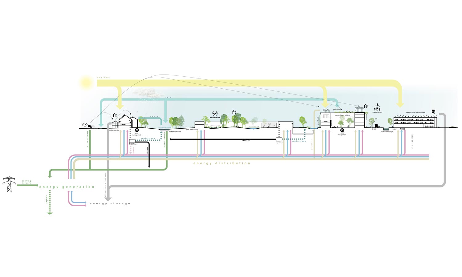
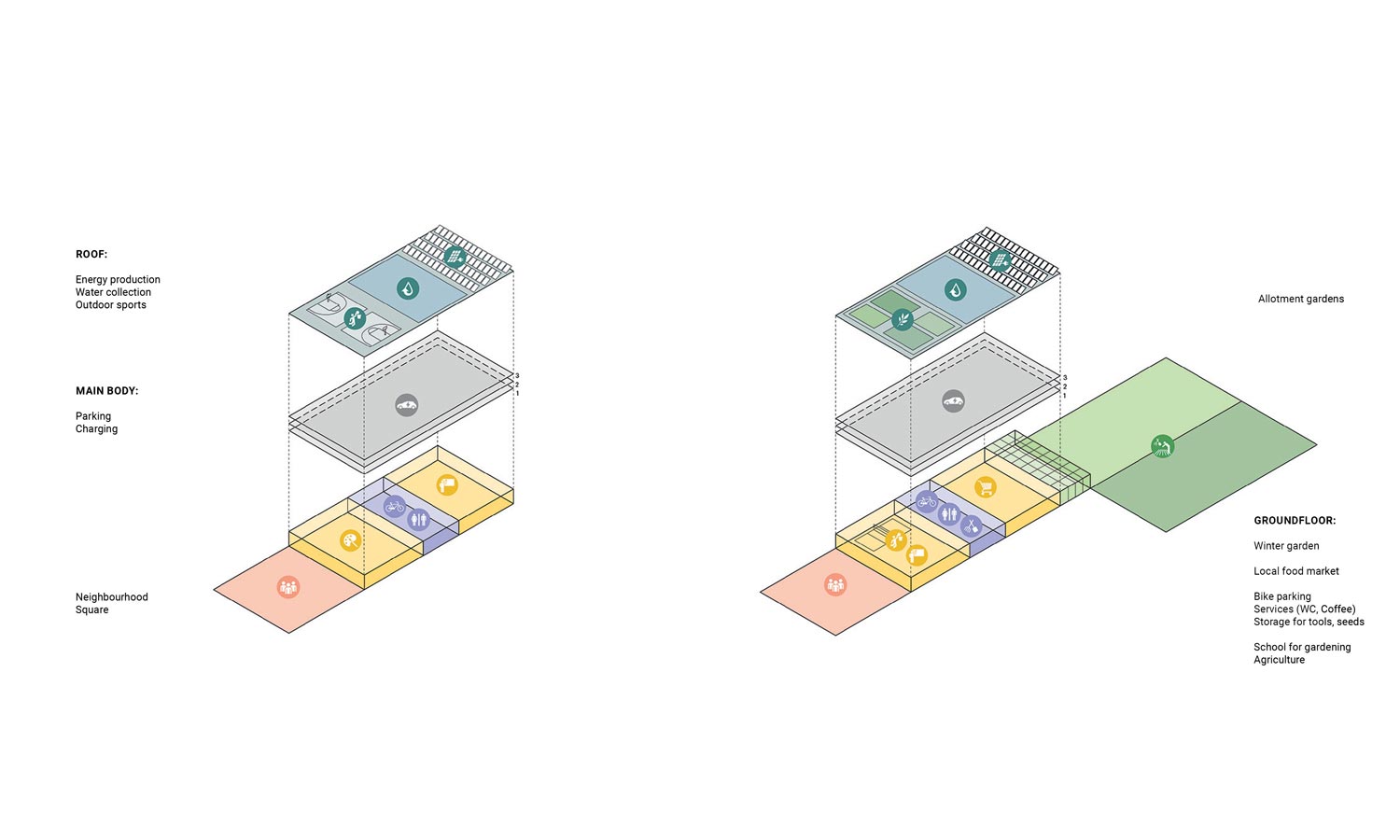
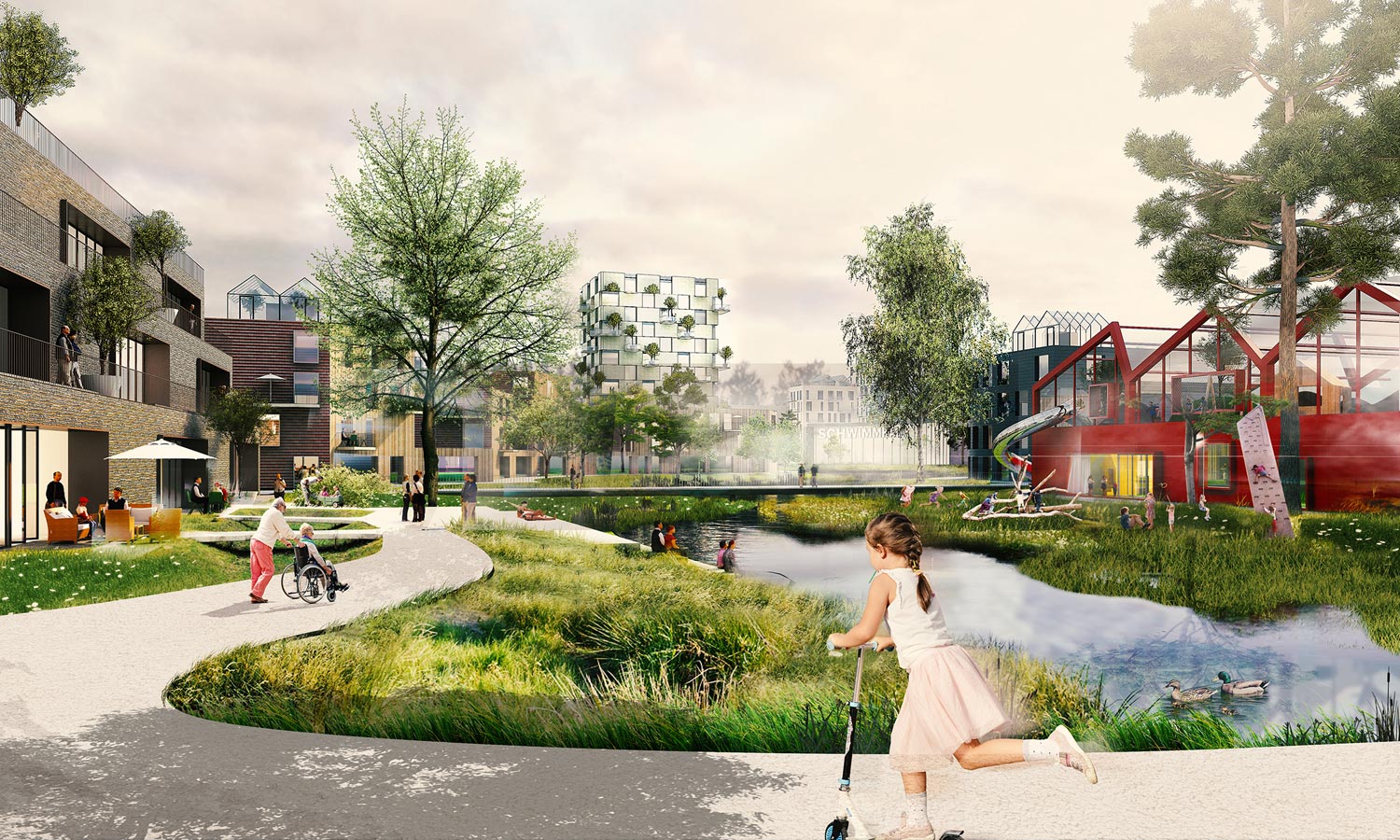
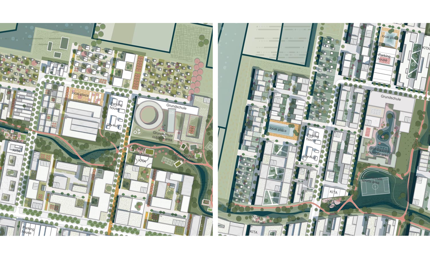
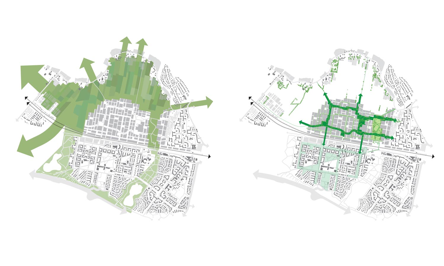
After developing new residential neighbourhoods in its harbours, Hamburg is now expanding into the countryside surrounding the city. The area where Oberbillwerder is planned is not at all urban itself, so creating connections to the city is crucial – hence the subtitle of the masterplan: 'Connected City'. Yet ‘connected' also refers to aspects such as urban agriculture, and water and energy management. Oberbillwerder will be energy self-sufficient and properties to buy and rent will be available in all price classes.
The masterplan was jointly made by landscape architects at the Dutch office of Karres and Brands and architects and urban planners from Adept in Copenhagen. 7000 new homes and 5000 workspaces will be built, as well as shops and facilities. Hamburg city centre is a mere 15-minute drive using existing infrastructure. To optimise the connections, the masterplan places great emphasis on public transport and bicycle and pedestrian mobility. Another key objective is to make connections between the neighbourhood and the surrounding area.
The new neighbourhoods, the cycle lanes and pedestrian routes, the public transport system and the blue and green structure of Oberbillwerder are closely interlinked. The way the area is organised will contribute to the climate-proof nature of the new district. The streets are convex rather than concave, and wide canals, large wadis and streams will be introduced to create different atmospheres: the canal-side has a more urban feel than a green field for rainwater infiltration. The types of houses, facilities and the outdoor space will be adjusted to the different atmospheres. The result will be maximal diversity, as befits a big city like Hamburg.
The masterplan has been awarded the highest certification (platinum) from the German Sustainable Building Council (DGNB). The combination of the size of the new district and the focus on sustainability is particularly unusual. The jury concluded that rural areas near existing cities are ideal sites for introducing sustainable, healthy, future-proof new developments.
Location Oberbillwerder, Hamburg (G)
Commissioned by Hamburg Stadt, IBA Hamburg
Designers Karres+Brands, Adept
In collaboration with Transsolar, Büro Happold, Kraft
Size 360 ha
Programme 7,000 homes, 5,000 workspaces
Design 2018
Execution from 2021
on beauty ...
Beauty is a catalyst for connection
Anouk Vogel / landscape architect
‘One thing is certain, we humans do not make the world a more beautiful place.’ A young man on a work placement in my practice suddenly uttered
these words while looking dreamily at the parking space outside the office window. I was busy making coffee, but once I’d digested the full import of his words, my first reaction was one of
sadness. But this emotion soon gave way to a feeling of urgency.
Why do I, a landscape architect, find it important to engage with beauty? Because I am convinced there is a connection between beauty and happiness. By ‘beauty’ or ‘aesthetics’ I don’t mean how
things look. It’s not about physical characteristics, but about sensory experience. I experience beauty as something exciting, moving and inspiring, which then becomes a catalyst for connection.
We want to share our experience of beauty with others – it prompts us to engage in dialogue with one other.
Next, beauty has a protective role. We are motivated to take care of places, objects and people that we feel a connection with. I’m not talking about the kind of beauty that can be measured
according to the golden ratio. I’m interested in how places and objects acquire a soul. I’m particularly fascinated by the beauty that is waiting to be discovered during the design process:
fragile, subtle and hesitant beauty, perhaps already present but not yet tangible in form or context.
I was trained according to the principle that beauty is a side issue in landscape architecture. I have never agreed with this viewpoint. Even now, I still don’t understand why landscape
architects shouldn’t take part in the debate on aesthetics. Looking back at my time as a student, it is ironic that although we were taught that aesthetics are a side issue, much of the teaching
was actually devoted to creating an emotional bond between people and their surroundings – which is exactly what I understand ‘beauty’ to be about and what motivates me in my work.
This column is also published in Scape #16 and in Blauwe Kamer #2.
september print issue
Feel free to share ...
Have you enjoyed this e-zine?
Are you curious to read the new September issue…?
Subscribe
now to receive 5 e-zines
and the print edition of ‘scape for €44.50
Ezine 2 / 2019
Text
Silke Rainen, Daphne de Bruijn, Harry Harsema, Martine Bakker
Translation & text editing
Sara Butler, Jackie Harsema
Design, concept & realisation
Daphne de Bruijn, Harry Harsema
Published by
Blauwdruk Publishers


